Tips for Choosing Calm Colors to Create a Relaxing Home
Creating a calm and peaceful atmosphere in your home starts with the colors you choose. Colors have the power to influence mood, energy, and even how spacious a room feels. If you want your home to be a sanctuary from everyday stress, selecting calm colors is a great place to start. In this post, we’ll share practical tips on how to choose calming colors that suit your style and space, helping you create a welcoming, restful environment.
Why Choose Calm Colors for Your Home?
Calm colors are typically soft, muted shades that promote relaxation and comfort. Unlike bright or very saturated colors that can feel energizing or intense, calm hues encourage restful feelings and create a peaceful ambiance. Spaces painted or decorated in calm colors tend to feel more open and inviting.
Some common calm color families include:
– Soft blues and greens
– Warm neutrals like beige and soft browns
– Light grays
– Gentle pastels such as lavender or pale peach
Using calm colors in your home can reduce stress and make daily life feel a little easier. Whether it’s your bedroom, living room, or even kitchen, calm colors help create a space where you can unwind.
Tips for Choosing the Right Calm Colors
1. Consider the Room’s Purpose
Different rooms in your home serve different functions, so it’s important to pick colors that fit those activities. For example:
– Bedrooms: Blues and greens are classic calming colors here, as they encourage restfulness.
– Living rooms: Warm neutrals and soft pastel tones can make these social spaces feel relaxing yet welcoming.
– Bathrooms: Light, cool colors like pale aqua or soft gray help create a spa-like atmosphere.
– Home offices: Softer shades of green or blue can improve focus without feeling distracting.
2. Think About Natural Light
Lighting makes a big difference in how a color looks in a room. North-facing rooms often get cooler, dimmer light, which can make some colors appear dull or shadowy. South-facing rooms tend to be brighter and warmer.
Before committing, test paint samples on the walls and observe them at different times of day. Colors may look warmer or cooler depending on sunlight or artificial lighting.
3. Start with Neutral Basics
If you’re unsure where to begin, start with a neutral base color such as off-white, beige, or light gray. Neutrals create a calm and versatile backdrop that allows you to add accent colors, textures, and décor without overwhelming the senses.
Neutrals are easy to pair with calming shades of blue, green, or muted pastel colors for a balanced look.
4. Use Soft, Muted Shades
“Calm” doesn’t mean boring! Choose colors with muted saturation rather than bright or intense hues. For example, instead of a bright turquoise, try a soft teal or dusty blue. Instead of bright yellow, consider a pale buttery shade.
Muted shades allow your décor and furnishings to stand out while keeping the overall effect peaceful.
5. Coordinate with Your Existing Décor
Consider the furniture, flooring, and textiles you already have. What colors and styles are present? The paint or wallpaper you choose should complement these elements.
For example, if you have warm wood floors, warmer neutrals and soft greens might pair nicely. If your furniture has cool tones, cooler grays or blues can unify the space.
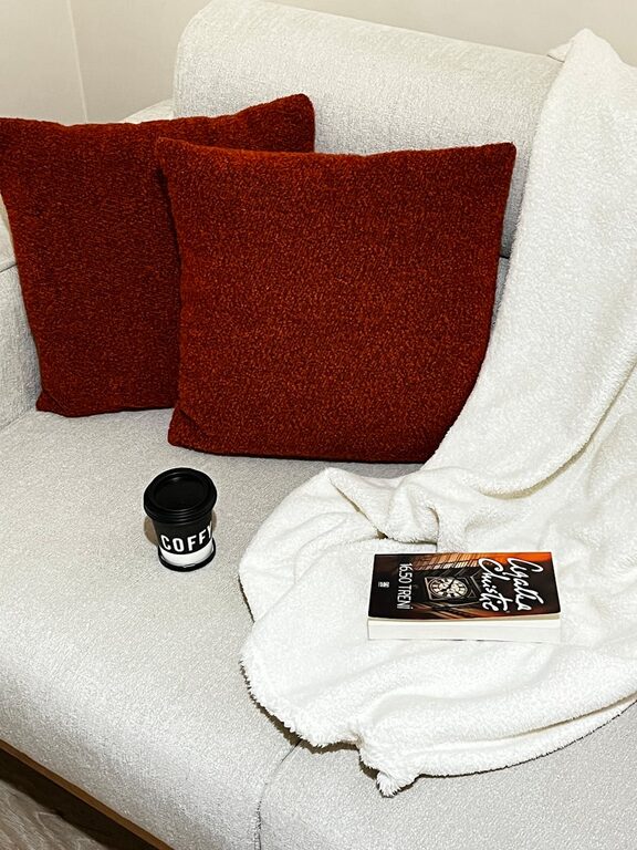
6. Use Color in Layers
Don’t be afraid to mix different calm colors in one space to create a layered, textured feel. Use paint on the walls, but also consider adding cushions, curtains, rugs, and artwork in complementary calming shades.
Layering color adds depth and interest without making a room feel too busy or chaotic.
7. Sample Before Committing
Always test paint colors with samples on your wall before painting an entire room. Paint small swatches and observe how they look under different lighting throughout the day and evening.
This simple step saves time and frustration by helping you see exactly how the colors perform in your actual space.
Popular Calm Color Palettes for Inspiration
Here are some calming color palettes to consider for your home:
– Seaside Serenity: Soft aqua, sandy beige, muted white
– Lavender Fields: Pale lavender, soft gray, cream
– Earthy Calm: Warm taupe, sage green, light cream
– Cloudy Skies: Light gray, powder blue, soft white
– Gentle Sunrise: Peachy beige, blush pink, light gold
Final Thoughts
Choosing calm colors for your home is a powerful way to create a soothing atmosphere that supports relaxation and comfort. Remember to consider each room’s purpose and lighting, start with neutral or muted tones, and don’t be afraid to layer colors or test samples before painting.
With thoughtful color choices, your home can become a peaceful retreat that feels welcoming and balanced every day. Enjoy the process of creating your calm space!
—
If you enjoyed these tips, feel free to share your favorite calm color combinations in the comments below!